It’s 2018! In all of the New Year excitement, did you create a list of, “ways to develop a ‘new you”? We certainly hope not, because we like you just the way you are. What we do want you to consider is how to stay fresh on the web…not like that! Let’s keep this clean, people. My point is, what are the web design trends of 2018 and how can we keep our web presence fresh? Ok, I’m going to stop using web and fresh together.
Similar to other industries, such as fashion, automotive, and furniture, there are trends that drive web culture. I’ve scoured the internet for the hottest web design trends of 2018, to help you decide if you’ll be an early adopter or laggard. Web trends, like the planets are constantly in motion. Let’s see what web trends are moving and shaking in 2018.
Web Design Trends of 2018
-
- Mobile
- Color
- Motion Graphics
- Typography
- Scrolling Effects
MOBILE
Last year, Google announced that a site’s mobile experience was a contributing factor in the “secret” algorithm that calculates a site’s organic rank. Naturally, once Google spoke there was a mad rush to optimize sites for mobile. This year will be no different.
Your website must be optimized for the mobile user because the fact remains that the number of mobile users has surpassed the number of desktop users. If you want your audience to have the most positive experience on your site it absolutely must be responsive.
Two very simple issues with mobile usability are font size & proximity of buttons.
The font on your mobile site should be legible enough that a user does not need to pinch and zoom.
Proximity of buttons is probably the most frustrating issue with poor mobile-view. If a person is trying to click on the “about” page but is accidently pressing the “registration” button, you have an unhappy user on your hands. Make sure buttons are sized appropriately and far apart enough where each is a distinct function.
Need to know if your site is mobile friendly? Yes, yes you do! Ask Google, they’ll tell you right here.
COLOR
Once upon a time web designers were constrained to “web safe” colors. That day is long gone. Today, in 2018, web designers are getting BOLD with color choices and brace yourself, even reviving the use of gradients to add depth.
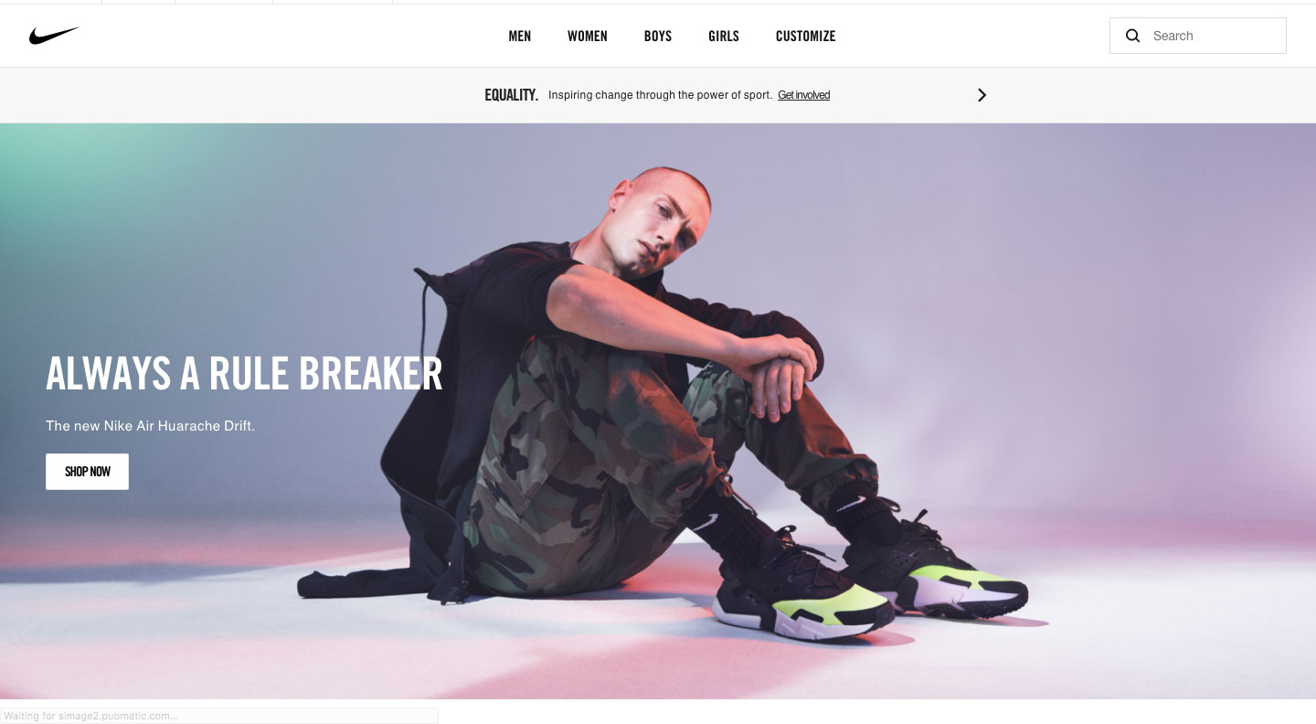
Nike.com implemented a subtle gradient with spring pastels as a background to an edgy image.
Vibrant colors evoke emotions and help to paint a story. We’re so dedicated to color theory, we hosted an instagram series dedicated to #ChooseWisely: The Psychology of Color. If your brand colors aren’t aligned with your customers or mission, you may want to consider which colors are going to help drive success.
MOTION GRAPHICS
Just as quickly as web developers realized that video banners were dragging load time, they found a work around: smaller files with just enough motion graphics and animation to draw in the user without the giant files sizes that push up load times and push away site visitors. Studies show that users are 50% more likely to leave a site that takes more than 3 seconds to load.
Using animated headers with unique illustrations to tell your story is a technique which users are more likely to appreciate. Think about it, a site visitor isn’t likely to notice that you’ve spaced your buttons appropriately (unless you didn’t). While, a well told story is likely to evoke emotions and be shared with colleagues.
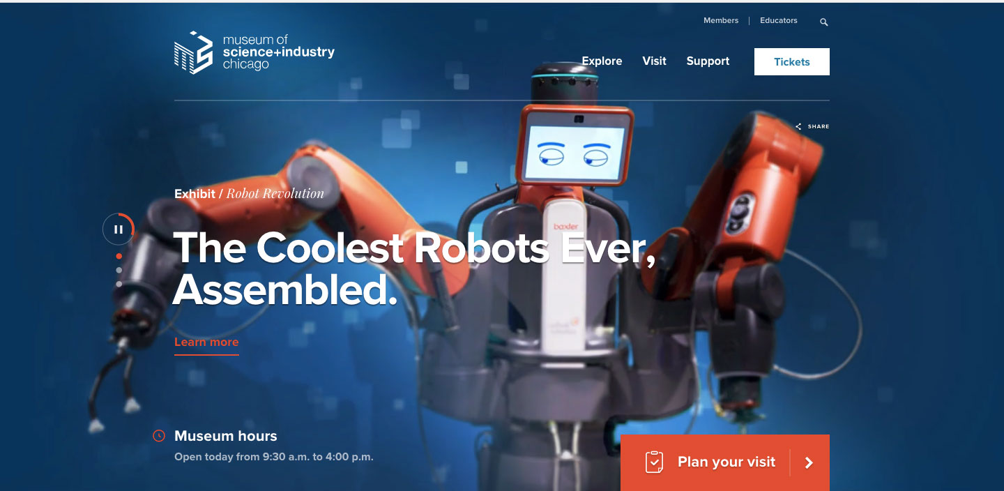
Chicago’s Museum of Science and Industry adds a simple motion graphics to the robots eyes, to add subtle engagement and keep load times low.
Typography
Few design elements have withstood the test of time, as evidently as typography. From ancient hieroglyphics to our modern day obsession with helvetica, typography is the most critical vehicle of your message. Face it, if your consumer can’t decipher your message then it’s failed.

Cartier uses engaging typeface to draw in a web user and drive clicks.
Strong typography transforms itself into stimulating visuals. Tenacious visuals engage users and most effectively relay messages. Typography can sometimes seem like an unsung hero of design, but use it effectively and it can be the super hero of your website.
Scrolling Effects
 Subtle yet sexy, like the ‘girl next door’ of web design. A well executed scrolling effect can be just the cost efficient level of elegance your site needs. Here at The Lemon Ad Stand, we’re a fan of the scrolling effect. It’s a unique way to add depth to a one page site.
By keeping a static image behind the scrolls, you keep the viewer engaged. In case you haven’t noticed yet, engagement is a theme here. In using a scroll effect to move copy over an image, the user is literally driving the engagement of the site.
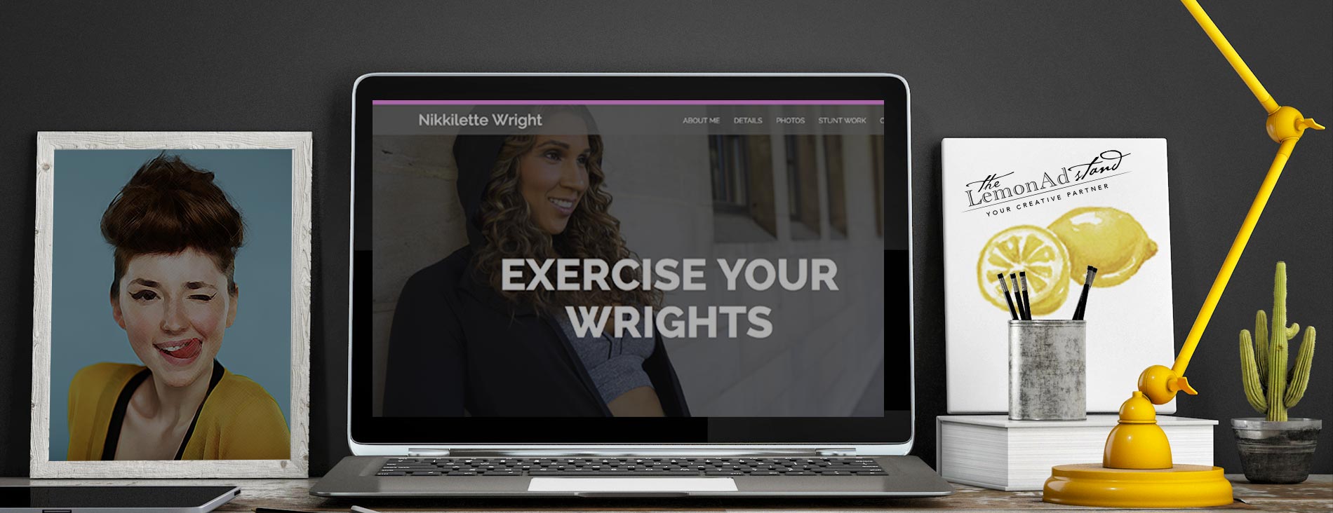
Visit NikkFit.com to engage with her photos and copy. You’ll notice that as you scroll through the site, the background images changes. This creates a unique gallery experience driven by you, the user. You aren’t scrolling through a traditional gallery format yet you’re experiencing the gallery in the same way you’d walk through a brick and mortar gallery.
The scrolling effect is bound to have a good year in 2018.
It’s April but don’t be dismayed, you have plenty of time to restart your diet, read the book on the nightstand, brush up on astronomy and implement some of these web design trends of 2018 to your own site.
Happy “New You” Friends,
The Squeezers