Work
Serving as EarthColor’s full service design team we were charged with creating distinct design elements and brand standards for two specific products being offered, Scodix and Alchemy, while aligning the EarthColor’s commitment to sustainability.
Strategy
As EarthColor’s full-service design team, specific projects spanned the gamut of creative print marketing, while focusing on two new products. To highlight existing capabilities, but also inspire new boundaries, TLAS designed marketing materials with emphasis on the key capabilities of each product.
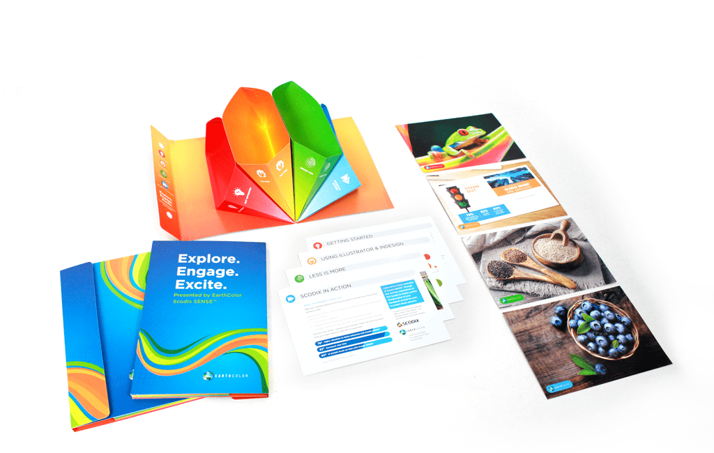
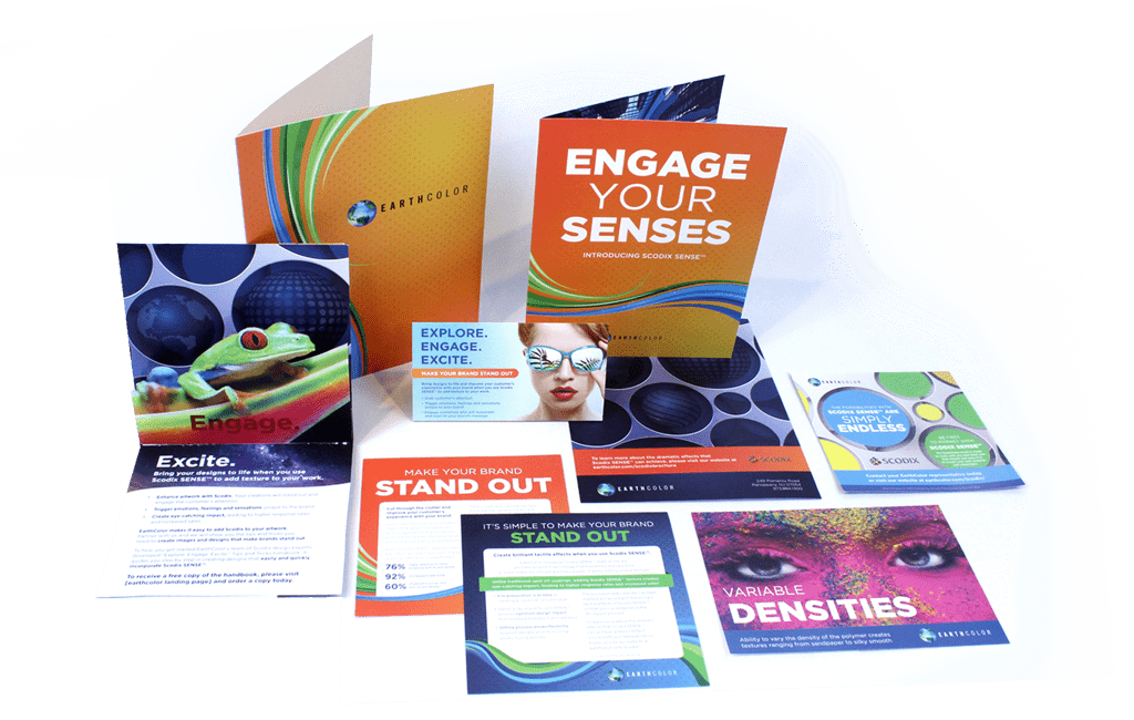
- Scodix – In developing the brand standards for this product line, our focus was on the capabilities and creative use of the product, as well as the education of its users.
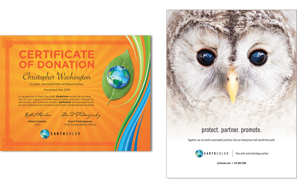
The LemonAd Stand (TLAS) focused on bright colors and bold textures. Scodix is an application that adds tangible texture to printed marketing pieces. The use of imagery with bold colors and textures is necessary to adequately showcase the product. In alignment with Earthcolor’s commitment to global sustainability, visuals often include green spaces or endangered animals.
In creating brand standards specific to Scodix capabilities, we developed the color streams to represent EarthColor, a print company, which primarily works in bright, flowing color. A lower opacity version of the streams were tied directly to Alchemy, the latest product launch, to maintain brand consistency.
SPECIFIC ELEMENTS:
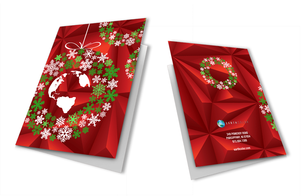
TLAS created postcards, holiday cards, sales sheets and a robust style guide to educate designers on the capabilities of Scodix.
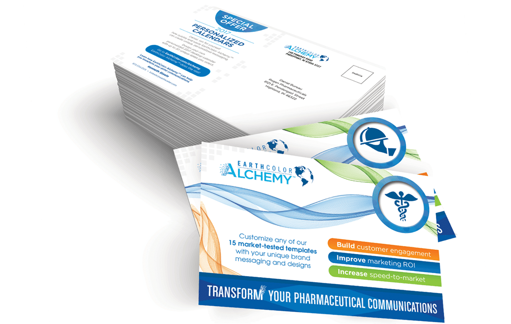
- Alchemy – In developing the branding for Alchemy, we maintained brand consistency, while also distinguishing it from the Scodix line by lowering the opacity of the color streams and minimizing the use of colors. Because this product is digital, it did not include the replication of the CMYK boldness we had previously used.
In developing a logo for the product, we incorporated the pixelation of the ‘A’ in Alchemy to signify the fluid capability of this product. Clients can make critical, yet, simple changes to a designed piece by simple distinctions in an Excel doc.
SPECIFIC ELEMENTS:
For Alchemy, we created the logo, brand standards, information postcards, and the information guide for clients to understand the product.
result
By contracting The LemonAd Stand, as their full service design team, EarthColor saves significantly each year over the cost of an internal design team. They are also provided a wider net of creativity and diversity in design styles.


