Work
As many of The LemonAd Stand’s (TLAS) clients, Fretzin BD Performance was referred by another one of our very satisfied customers. Fretzin BD Performance was in need of a logo refresh, modifications to the business proposals, the client presentations and a modernization of illustrations.
Strategy
In preparing to partner with Fretzin BD Performance to refresh the business development resources, we spent time getting to understand the brand. Who is the target market and what strategies are currently implemented to engage the market. From these conversations, we realized a full rebrand wasn’t necessary. By focusing on three specific components of the business development resources, the materials are refreshed while still maintaining the integrity of the content.
Logo Refresh
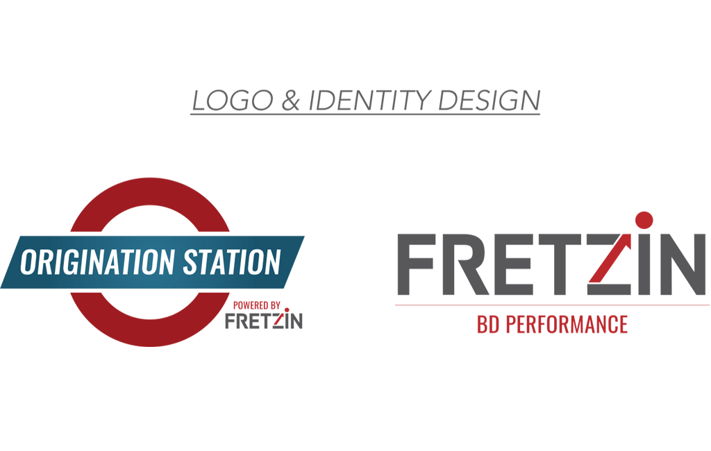
“The Origination Station” is a visual resemblance of the London underground system logo. The emulation of the logo is meant to emphasize the system’s ability to move your business forward.
In modifying the “Fretzin BD Performance” logo, the font was updated to include a distinct “R” that offered a very sharp angle to contrast with the highlighted backbone of the “Z”. While the “Z” still resembles an upward arrow, signifying business growth, TLAS opted to distinguish the arrow by making it red and giving it a goal with the red ball at the top of the “i”.
Proposal & Presentations
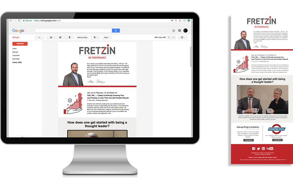
To refresh the proposals and presentations offered to clients, Steve Fretzin turned again to TLAS. In aligning these specific resources with the new logo, we incorporated the red, along with the sharp gray lines for brand continuity.
Book Illustrations
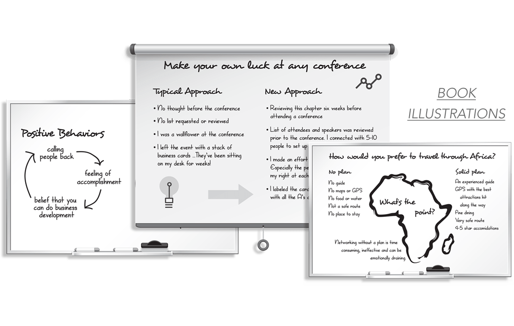
For the refresh of the existing book illustrations, the most critical aspect was to update the fonts for optimal legibility, and to change the line art for a more modern feel. It was very important that the integrity of the information remain the same, so the changes were subtle but significant.
In rebranding these business development resources, our team incorporated the red to brighten the brand and to add continuity with the sharp edges. Venturing into unique business models is our favorite part of being a creative partner.


