Work
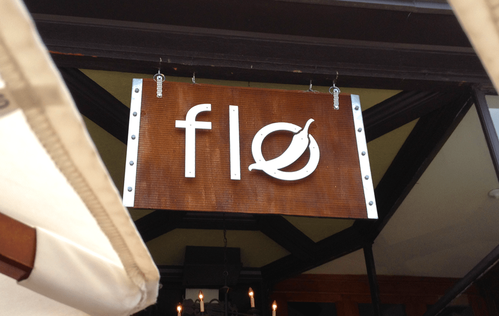
In the initial phase of this restaurant brand development, The LemonAd Stand (TLAS) was charged with updating the Flo logo. Which then opened the door for the opportunity to use our ‘hands on’ creativity in creating the FLO entrance sign. The logo and the entrance sign became icons in the development of all the restaurant brand development from the website to the hot sauce labels.
Strategy
In developing brand continuity for Flo, TLAS organically came to two key focal elements; the Flo pepper and the grate texture from the custom made entrance sign. These two elements provide the brand continuity now synonymous with Flo.
The Logo
The crux of any restaurant brand development is exactly where TLAS started. The original logo had been acquired when the restaurant was purchased and was due for an update. We modernized the typeface and found an effective way to incorporate a custom illustrated pepper to give a nod to Flo’s New Mexico influence, known for it’s chili peppers.
The Hand Crafted Signs
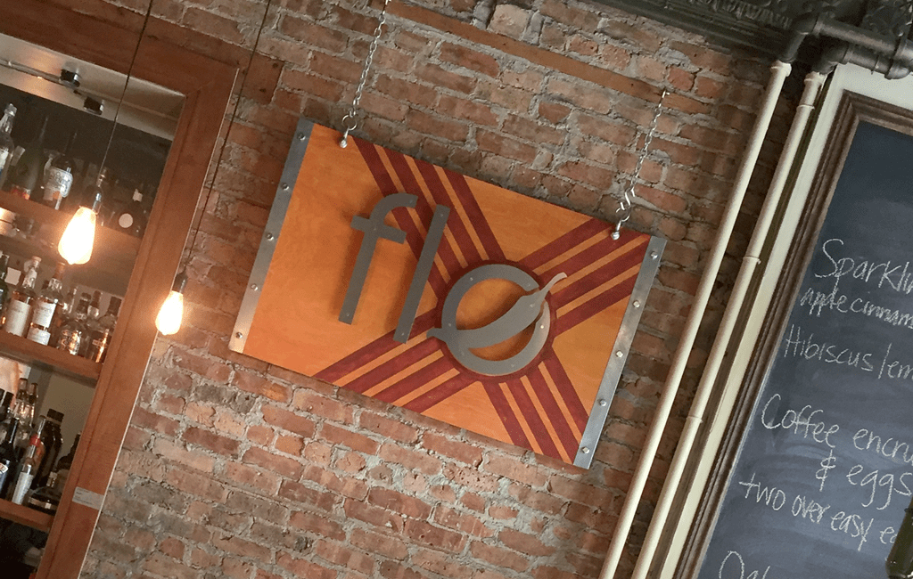
With the collection of reusable woods and metals we began to handcraft the background of Flo’s new exterior signage. With the help of Tukaiz printing department, we were able to cut out a weather resistant faux metal of the newly updated logo. The success of the entrance signage quickly inspired the creation of an interior handcrafted sign, which pays homage to the New Mexico flag.
Brand Elements
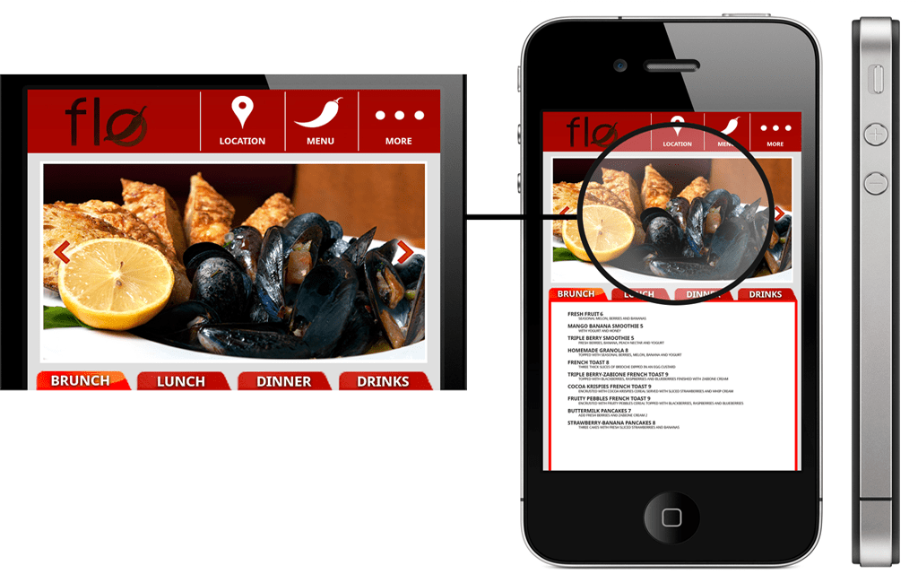
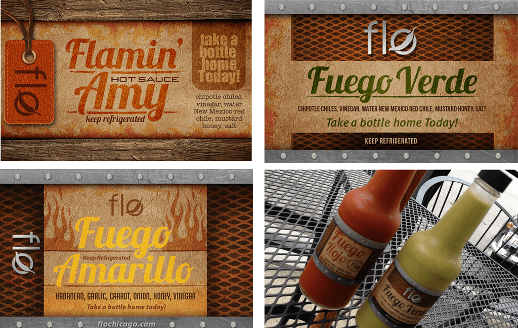
Throughout the web design the pepper is incorporated as a nod to the restaurant logo. The grate from the outdoor sign is also incorporated in key design elements such as the restaurant business cards and the labels for the homemade hot sauces. This continuity of design is critical to successful restaurant brand development.
result
Since The LemonAd Stand partnered with Flo in 2012, profits have more than doubled and fiscal growth has continued each year.


