Work
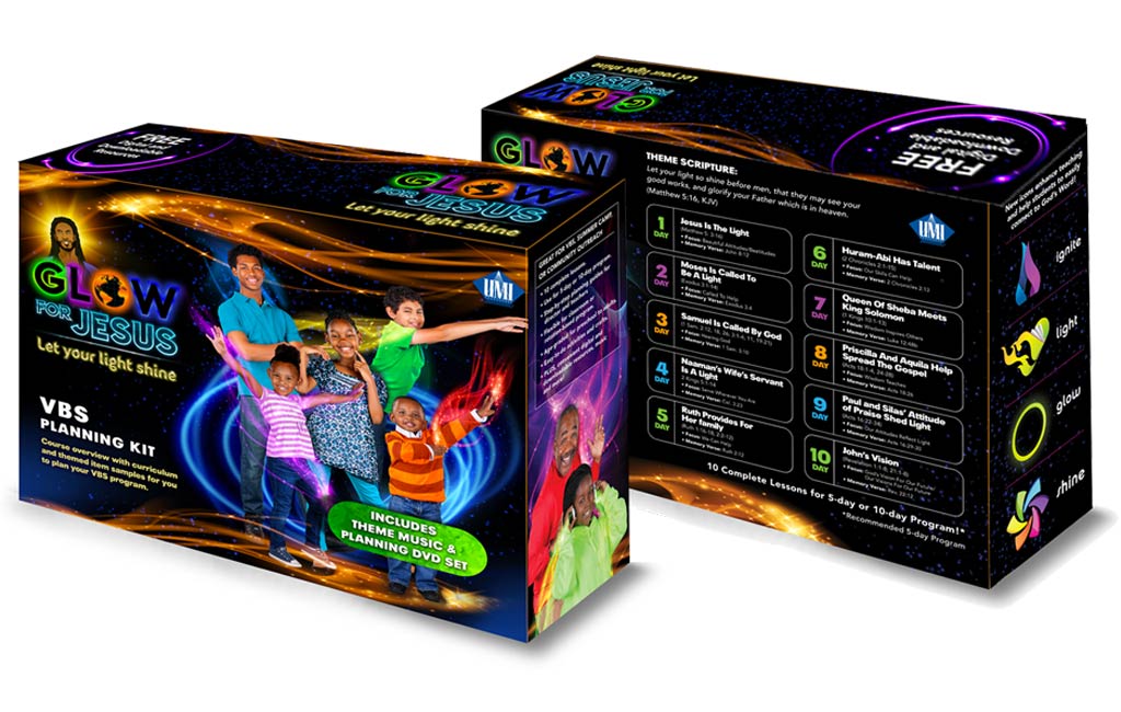
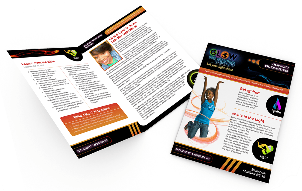
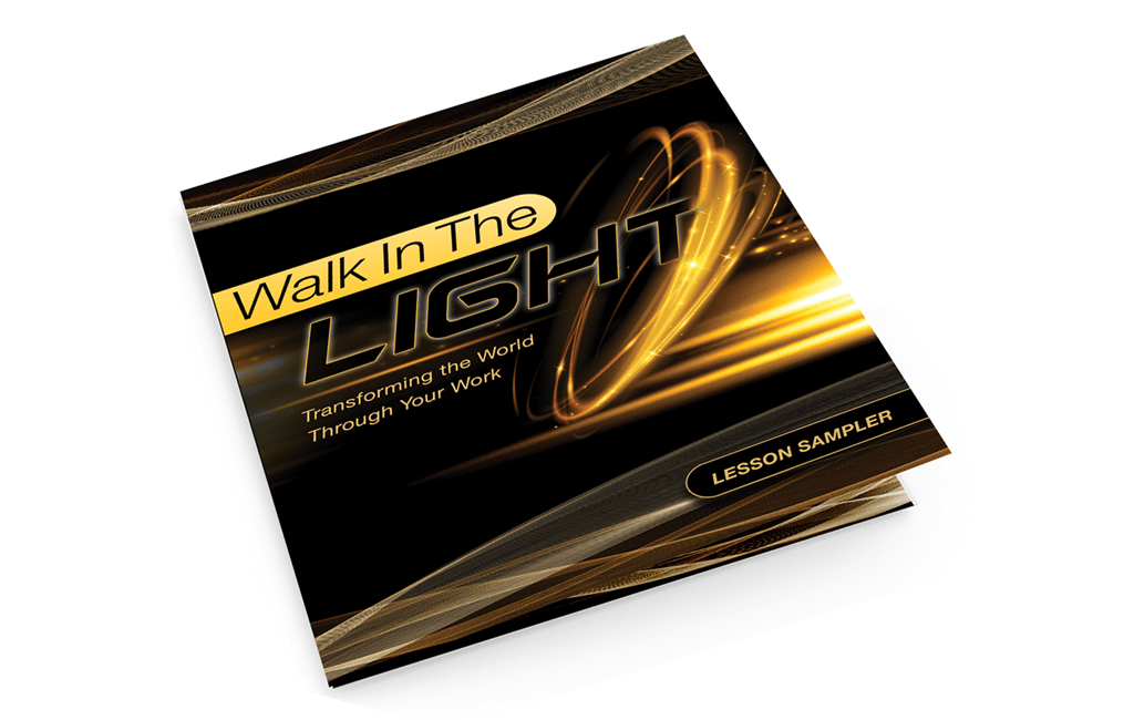
In partnering with UMI, The LemonAd Stand (TLAS) developed elements of the annual vacation bible school branding. We created the theme graphic (logo), organized and executed a photo shoot, designed the individual lesson plans, and the unique package design for a vibrant and cohesive vacation bible school branding campaign.
Strategy
The 2017 theme was “Glow for Jesus, let your light shine” which was to be executed through fluorescent imagery and flowing light. Each element of this cohesive vacation bible school branding campaign was designed with the consumer in mind. These elements needed to engage the instructors and teachers equally.
Theme Graphic
The font choice for the theme graphic is designed to directly emulate fluorescent signage, while the glowing globe is incorporated to signify the light of the Lord shining globally. The color selection replicates fluorescent lights but also are shades that are universally enjoyable across UMI’s target markets.
Photoshoot
TLAS executed a photoshoot to capture children and adults in energetic poses. From inception, we envisioned the individuals playing with flowing light throughout the packaging and specific marketing collateral.
For the individual lesson plans, we had access to the topics and themes in advance. As such we were able to orchestrate scenarios and props to articulate the specific messages and the age demographic of each lesson plan.
Package Design & Collateral
While we had plenty of fun on the set of the photoshoot, designing and mocking up the packaging was equally as exciting. The box needed to be black to effectively execute the glowing theme. The black box had its challenges in terms of printing but the process was well worth the outcome.
The design of the box was a seamless process as each image had been orchestrated specifically for the cover or side of the box. Some of the images were repurposed for posters, puzzles and the lesson plans. The repurposing of the images allowed for theme continuity, and a cohesive brand.


